
City of Cerritos Seniors
Responsive Website Redesign Project
Role
UX/UI design, Prototyping,
Usability testing
Team
3 designers
Tools
Miro, Invision, Figma
Timeline
3 weeks
Problem
City of Cerritos Seniors lacks accessibility and ease of navigation, resulting in an increase in call volumes of the senior users who failed to find desired information online.
Solution
Redesign the website as a stand-alone website targeting senior users. Making the website accessible to seniors and having the online registration process simple and easier to understand to decrease the call volume.
User Research
The median age for caregivers was
49 years old
The median age for retirement was
62 years old
and 82% of the people in that age range use the internet
Population breakdown by age
More than 1/3 of the Cerritos population is potential caregivers and seniors
However, Cerritos lacks online resources for its senior population.
The City of Cerritos has a small senior section on their website, but the information is not easily accessible for the senior users, too hidden and very unorganized.

41%
23%
36%
50 yrs old and up
0-19 yrs old
20-49 yrs old
“major user of our website is caregivers and seniors ”
“We would really like to improve the online registration process
because we still get a ton of calls about how to do it online. ”
Meeting with the stakeholder.
We reached out to the Cerritos Senior Center and were able to get in touch with them.
Luckily, they have been looking to redesign their website so we asked who is their target user and what they are looking to improve.
User Interview
we interviewed caregivers and seniors to see where they find information regarding local senior activities, events, and resources and everyone had trouble finding the resources and services online.
-
Feels stressed and burdened
-
Struggles to find information for
the senior centers and activities.

-
Struggles to have access to basic necessities.
-
Feels lonely and wants to socialize.
-
Know how to use the internet but struggles to find resources and services.
Robert needs help!
We focused on our persona to the senior users since they have more difficulty using technology. If we redesigned the website easy enough for seniors to use, the caretakers would have no problem using the website since they are more comfortable with the internet.

Seniors like Robert need to quickly, easily, and intuitively find information about online volunteer registration for the senior center, because they struggle with technology and feel overwhelmed easily.
Our Vision
The website we are redesigning will help the City of Cerritos elevate awareness around information and services for seniors by providing content that gives the elderly and their caregivers opportunities to discover experiences and resources to improve their quality of life.
Additionally, it will help retired residents easily access and register for available volunteer opportunities to become more involved with their community and enhance their well-being and sense of purpose.
Current Website Evalutaion


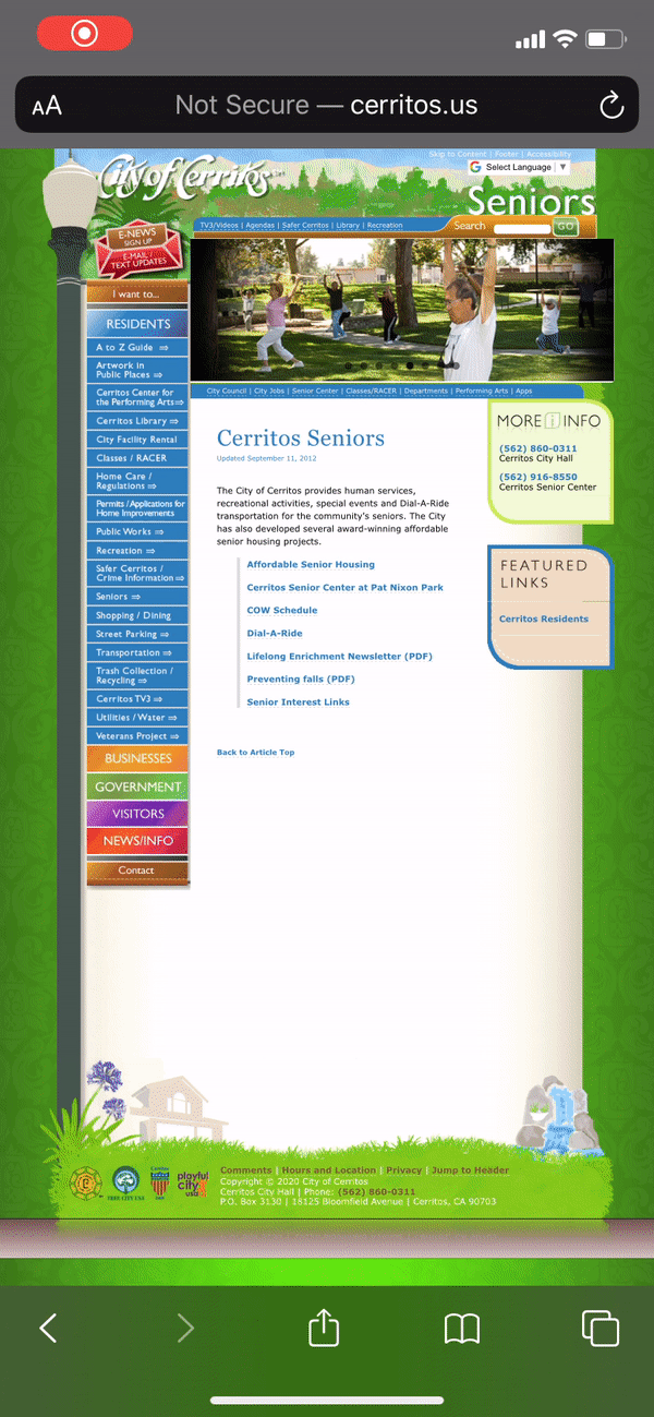
Major Issues & Potential Pain Points
-
The Senior section of the website is too hidden for users to find.
-
The website is not responsive on mobile devices.
-
Extensive textual information and links with no hierarchy.
-
Dull aesthetic, no visuals, and overwhelming color palette
Defining problems


Our Solution
City of Cerritos Seniors lacks accessibility and ease of navigation, resulting in an increase in call volumes of the senior users who failed to find desired information online.
We believe that we can solve this problem by redesigning the website as a stand-alone website with a focus on senior accessibility.
-
Organize navbar to easily guide the seniors to correct information.
-
Easy online registration process and clear contact information.
-
Minimalized colors and more images to help add breathing room and provide a visual aid.
New Navbar
Rearragned and divided the contents in the navbar Through card-sorting

Style Guide

-
Logo and color palette: Provided by the stakeholder but we decided to narrow the colors down one main color and one secondary color.
-
Clear CTA: Easy to identify buttons
-
Imagery: We chose friendly and welcoming images to make the website more approachable.
-
Font: one font face to reduce potential confusion for the user and maintain clean, professional, and easy readability for the user.
Registration forms

-
Forms with clear success and error messages.
-
Progress bar to break down the application to small sections.
Testing and Iterations
We started designing for the mobile version first.
User Task - Finding info about volunteering and sign up online to volunteer.


-
Hamburger Menu: several users did not recognize the hamburger menu during testing, so we changed it to say “menu” for increased clarity
-
Contact Information: although the senior center staff wanted reduced call volume, our user research indicated that users highly preferred in-person and phone in addition to online registration, so we included clear access to reduce frustrations.
-
Separated registration page: from user testing, we found the single page registration form was too overwhelming → iterated into separate pages for smaller, easily digestible information with a clear step progress bar.


.png)
-
Confirmation choices: user testing showed they wanted the ability to pick more than 1 option → iterated into multiple checkboxes for increased freedom.
-
Successful registration message: user research indicated that lack of clarity regarding confirmation as a pain point → clearly indicated when and how users would be contacted
Final Prototype
we created the web vesrion based on the updated mobile version after testing,

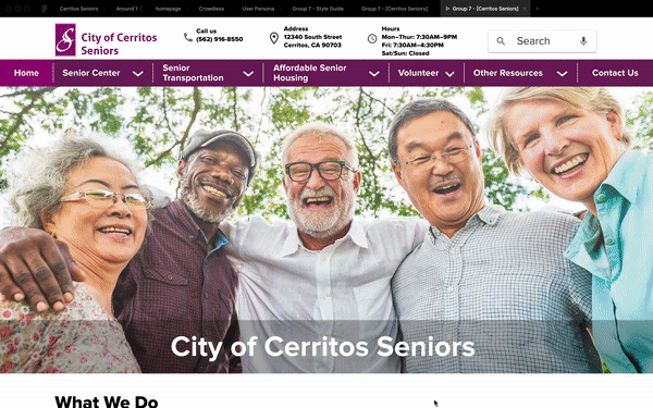


Homepage
-
Laid out all information on the homepage, because seniors may not utilize the navbar right away and want to get more info before clicking anything.
-
Warm, relevant imagery
-
Contact information easily accessible.

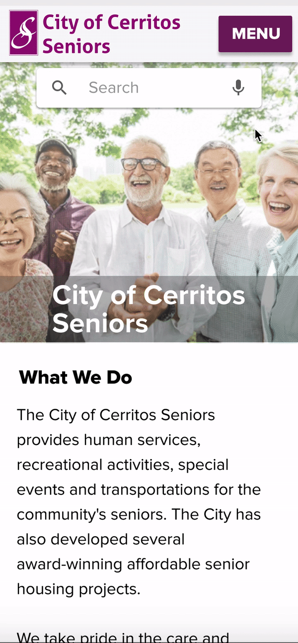
Navbar/Menu
-
Clear category, name of the navbar/menu items is self-explanatory.
-
Micro-interactions for clarity
-
Big fonts & drop-down boxes


Registration
-
Clear header and breadcrumbs
-
Progress bar to make each step of the application digestible.
-
Forms with clear error messages and micro-interactions.
-
Specific confirmation message.
Next steps...
-
Putting the website live to see if there is a significant difference in the call volume.
-
Converting PDF pages on the website into webpages so seniors can easily access without downloading the individual files.
-
Making senior classes and activity registration available online.
Final Thoughts
Finding a solution that met the needs of both the stakeholders and users was challenging. We were initially frustrated by the color palette and the logo that was given to us. However, once we empathized with the users, we were able to iterate and improve within the given constraints. Constant communication and user testings helped gave me confidence that empathizing with the users and making design decisions based on research will ultimately benefit the stakeholder and that will be an endless process.


